
Overview
UI craft showcase based on my frustrating experience with investment apps.
The problem: Revolut, Trade Republic, eToro = too many clicks, buried info, heavy flows.
My challenge: make buying stocks as simple as buying on Amazon. Without sacrificing depth.
3 pillars:
Clarity → Strong hierarchy, accessible data
Fluidity → Quick actions, short flows
Consistency → Clean design system, repeated patterns
1 - Context & Challenge
Investment apps are intimidating: too much info, too many clicks, too much friction.
My goal: make stock buying as fluid as e-commerce.
3 principles:
Priority info visible at a glance
Critical actions within reach
Patterns repeated everywhere
2 - Approach
No client, no brief. Just my user experience + 2 years on Trade Republic.
3-phase process:
1. Personal audit
Revolut, eToro, Trade Republic → too many clicks, confusing hierarchy, hidden CTAs.
2. Architecture
4 sections (Home, Explore, Portfolio, Settings). Market conventions respected.
3. UI + Micro-interactions
Green accent, white spaces, clear typography. Polished details everywhere.
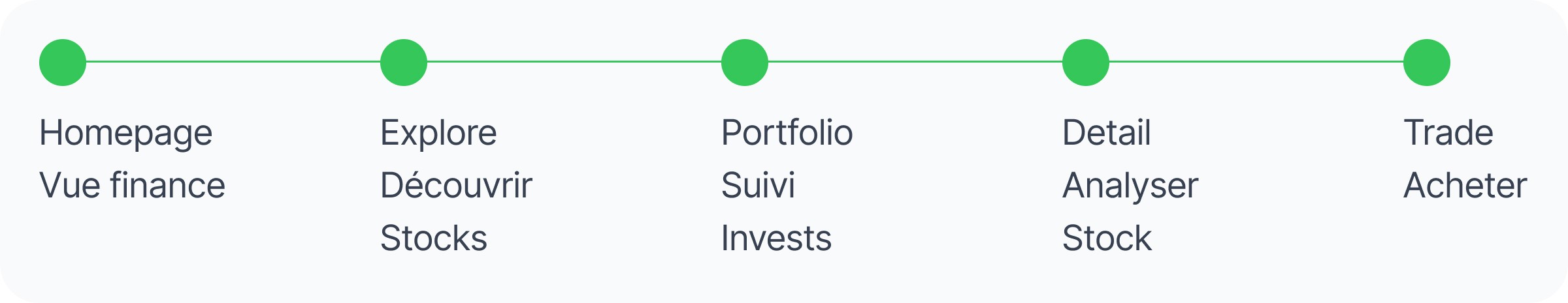
3 - User Journey
5 key steps:
Homepage → Finance overview + quick actions
Explore → Discover themes & trends
Portfolio → Track investments + metrics
Stock Detail → Complete analysis
Trade → Buy/Sell
4 - Design & Solution
4 pillars:
Visual clarity · Strong hierarchy, generous spacing
Quick actions · Accessible CTAs, immediate feedback
Consistency · Repeated patterns, respected conventions
Micro-details · Visual states, +/− variations, animations
Goal: fast investment decisions, zero friction.
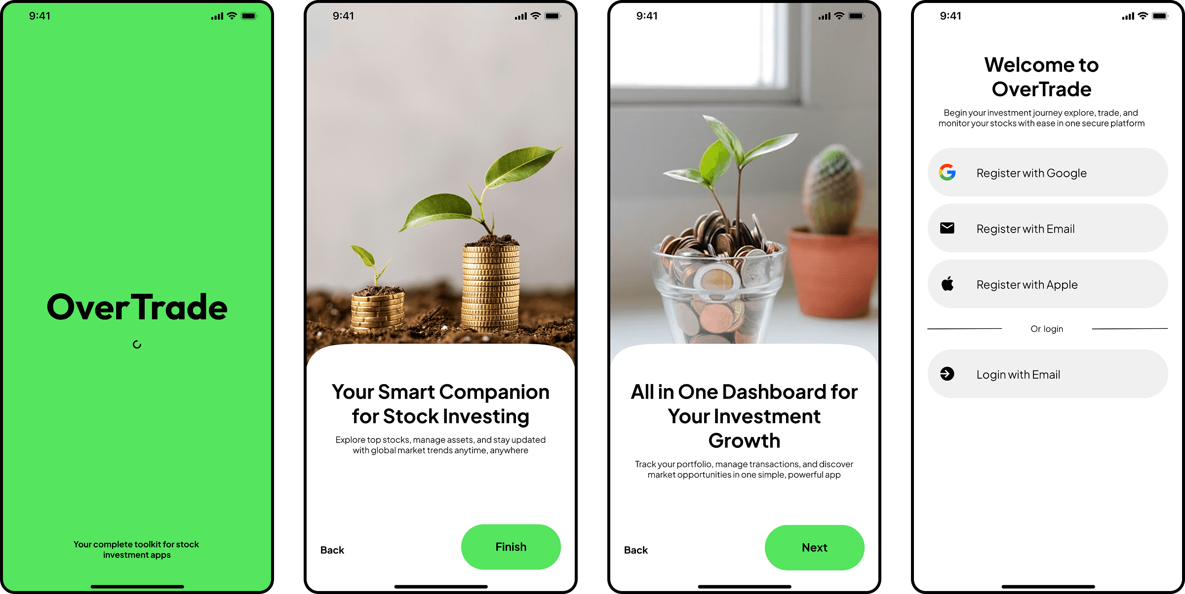
A - Onboarding
Splash (signature green) → 2 storytelling photo screens (growth) → Multi-option login. No friction. No forced tutorial.
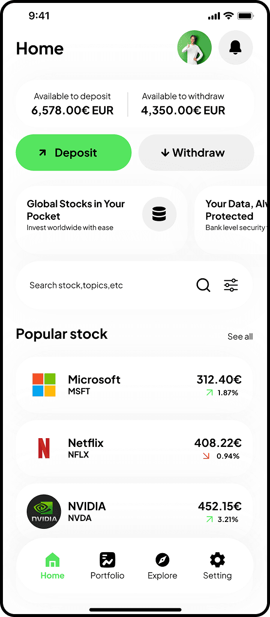
B - Homepage
The central hub. Users come back here for everything: check finances, take action, discover.
Screen 1: Homepage
Big balances. Contrasted CTAs (green = deposit, gray = withdraw). Light cards for discovery.
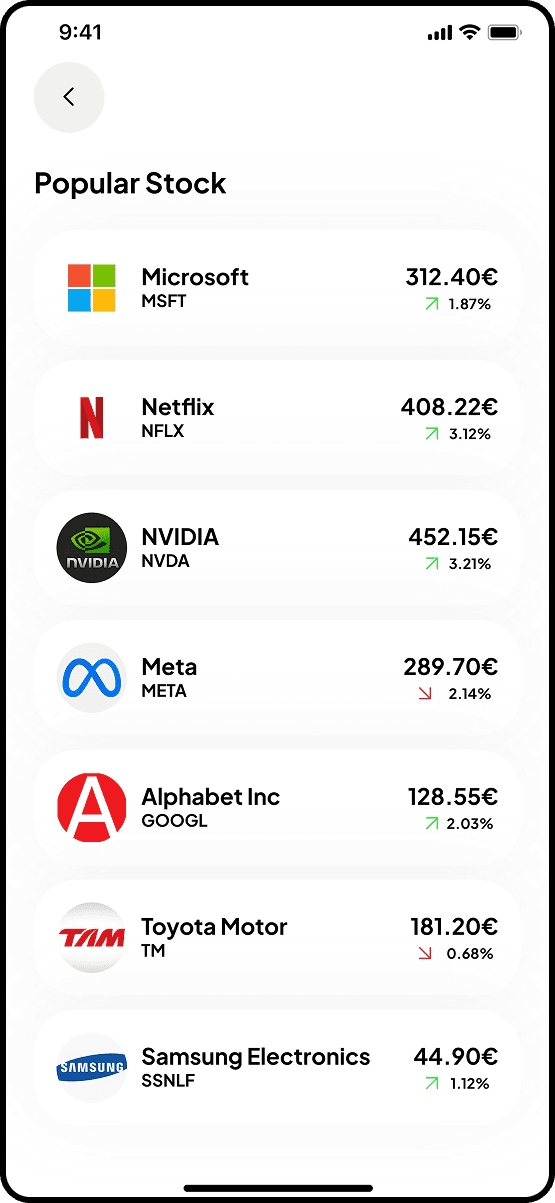
Screen 2: Popular Stocks
Full list accessible from homepage. Logo + ticker + price + variation. Quick performance scan.
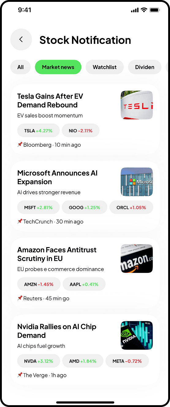
Screen 3: Notifications
News aggregated by category (market, watchlist, dividends). Variations displayed directly in cards.
C - Explore/Discovery
Flexible navigation: market themes (Fintech, AI, Cloud), trending stocks, top movers.
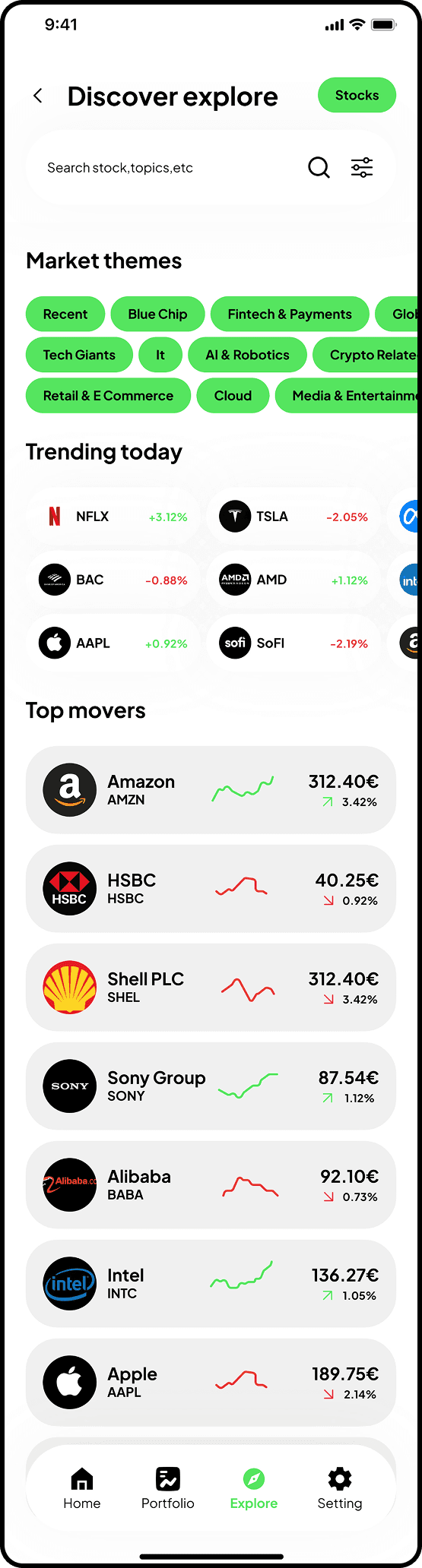
Screen 1: Discover
Interactive chips for themes. "Trending" & "Top movers" sections with clear visual indicators.
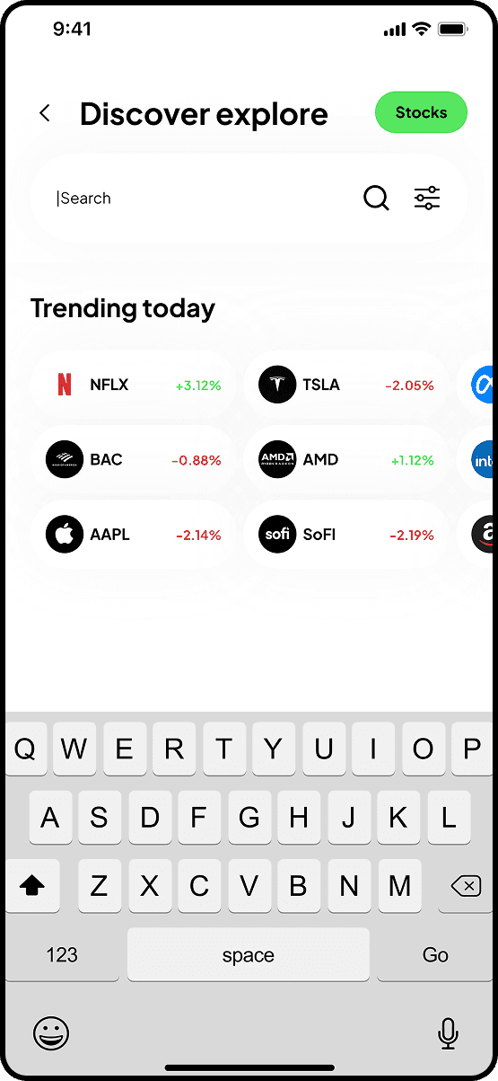
Screen 2: Active search
Immediate focus. "Trending today" suggestions stay visible. Clear active state.
D - Portfolio
Financial dashboard. Track investments, performance, quick access to positions.
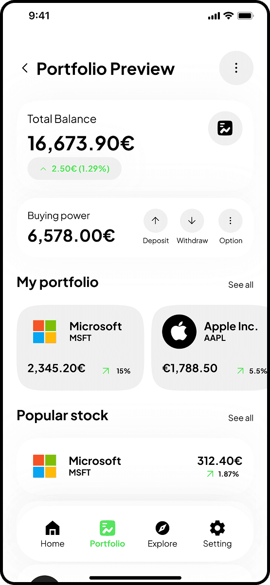
Screen 1: Portfolio Preview
Total balance + buying power. Personal investments upfront. Mix "My portfolio" + "Popular stocks".
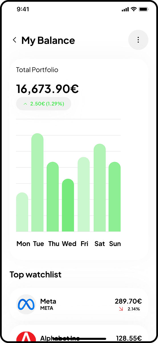
Screen 2: My Balance
Weekly evolution chart (minimalist green bar chart). Top watchlist for tracking.
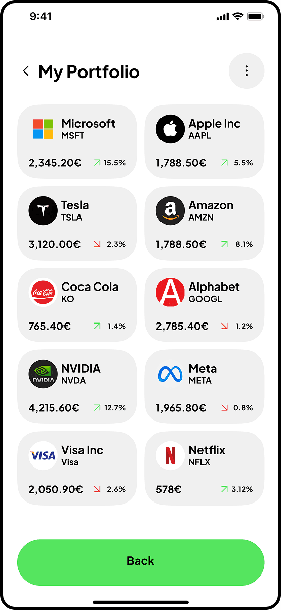
Screen 3: Grid view
All investments in cards. 2-column layout. Each card → stock detail.
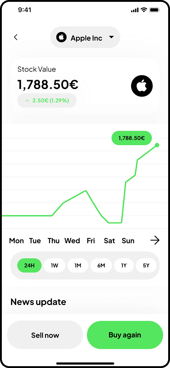
Screen 4: Stock detail from portfolio
Current value + evolution. Interactive line chart. Contextualized "Sell now" / "Buy again" CTAs.
E - Stock Detail
The decision screen. In-depth analysis before buying/selling.
Identical structure for all stocks:
Price → Chart → Stats → Company → Earnings → Analysis → News
Sticky "Trade now" CTA at bottom.
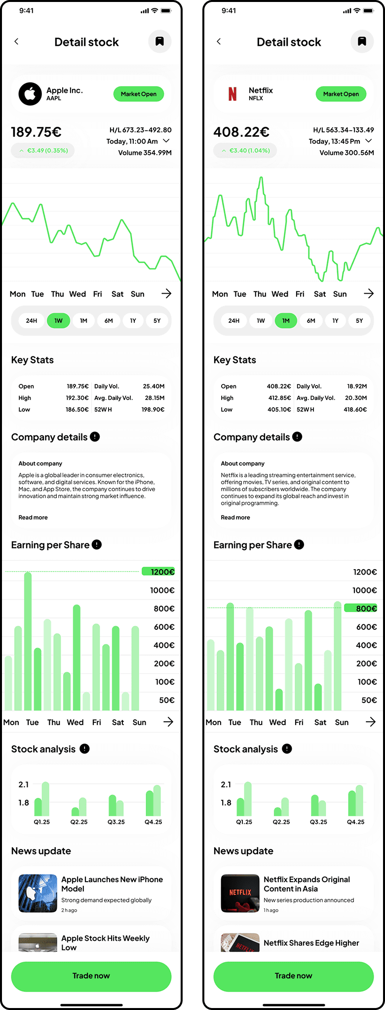
Craft note: Same layout, same sections, same hierarchy on Apple, Netflix, Tesla. Predictability = trust.
5 - Learnings
Visual storytelling engages from the first moments
4 onboarding screens with photo metaphors = not just decoration. It builds a narrative, creates emotional connection before the 1st interaction.
Designing without constraints develops creativity
No business, no tech. Just UX. This freedom pushed me to refine my craft vision.
Consistency reassures
On a dense app, repeating patterns (cards, variations, charts) creates reassuring predictability. Users focus on decisions, not on the interface.
Micro-details make the difference
+/− variations in green/red, active/inactive states, generous spacing. These details don't jump out, but their consistency builds credibility for a financial app.