
Overview
Leave management in quarksUp was functionally complete, but the complex interface made it difficult to access for all three profiles: employees, managers, and HR.
Working with a Lead Designer and a business expert, I redesigned the experience to make it intuitive and efficient.
Delivered into production in 2023.
1 - Context & Challenge
QuarksUp had a comprehensive solution.
The problem was not technical, but rather one of usability:
the interface was too complex and not very intuitive.
Employees had a confusing experience, with unnecessary clicks and multiple back-and-forth steps for a simple action.
Managers Managers did not have a clear view of pending requests.
Slow validation = frustrating delays.
HR retained all the functional richness while radically simplifying the experience.
The stakes: retain all the functional richness while radically simplifying the experience. 0 new features, UX/UI redesign focused on fluidity and clarity for each profile.
2 - Research & Discovery
Without direct access to end users, collaborative approach:
competitive benchmarking + internal business expertise.
I analyzed the solutions on the market (Lucca, PayFit, Factorial, etc.) to identify best practices.
At the same time, David (business expert) contributed his knowledge of the product and customer expectations reported by the sales and support teams.
These steps balance UX innovation, technical feasibility, and real needs.
Three design principles emerged from this work:
1. Simplicity of the process:
Minimum steps and clicks to request time off, while retaining the essentials.
2. Clear visibility by profile:
Each actor immediately sees what concerns them, without being overwhelmed by irrelevant information.
3. Quick validation
Facilitate request approval to streamline the end-to-end process.
3 - User journey
The journey was simplified around 4 key steps, designed to offer visibility and control to each actor.
Dashboard → View tailored to profile (requests, approvals, management)
Leave requests → Ultra-simplified, minimal friction
Approval workflow → Transparent and traceable (Manager → HR)
Calendar → Automatic updates, consolidated view of absences
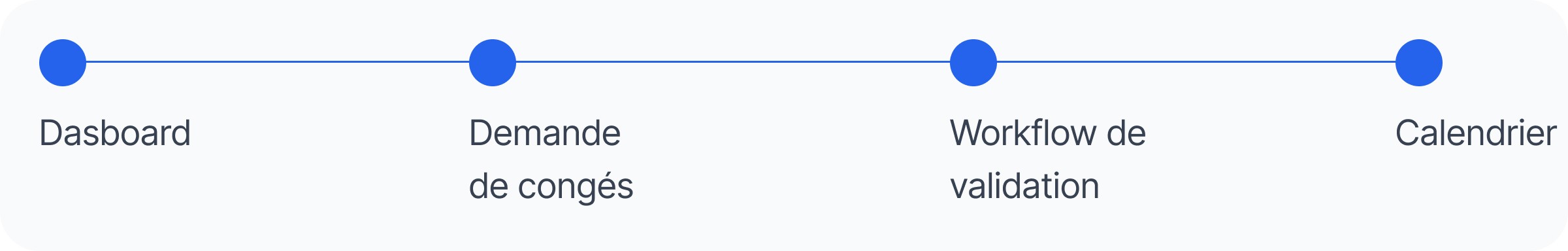
Principle: make the essential visible, and the rest accessible.
Leave management is not a core business activity; it is a recurring task that must be handled quickly and smoothly. The design had to take a back seat to efficiency.
3 pillars :
Custom dashboards: each profile sees what concerns them immediately
Ultra-simplified request: submit a leave request in just a few clicks, with clear guidance
Workflow visibility: know in real time where a request is at and who needs to take action
Objective: to reduce the time spent on the task while increasing confidence in the process.
A - Dashboard - Custom views by profile
Employee: pending requests + visible vacation balance Manager: requests awaiting approval + team calendar view HR: overall management with indicators, trends, alerts
L'info pertinente est mise en avant, le reste accessible en un clic.
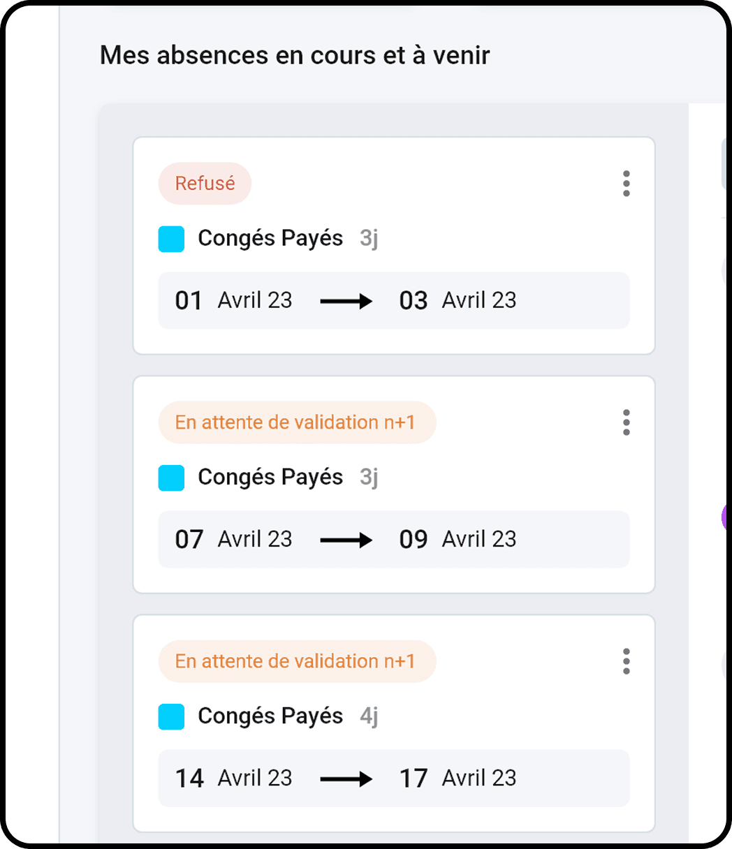
Screen 1: Employee Dashboard
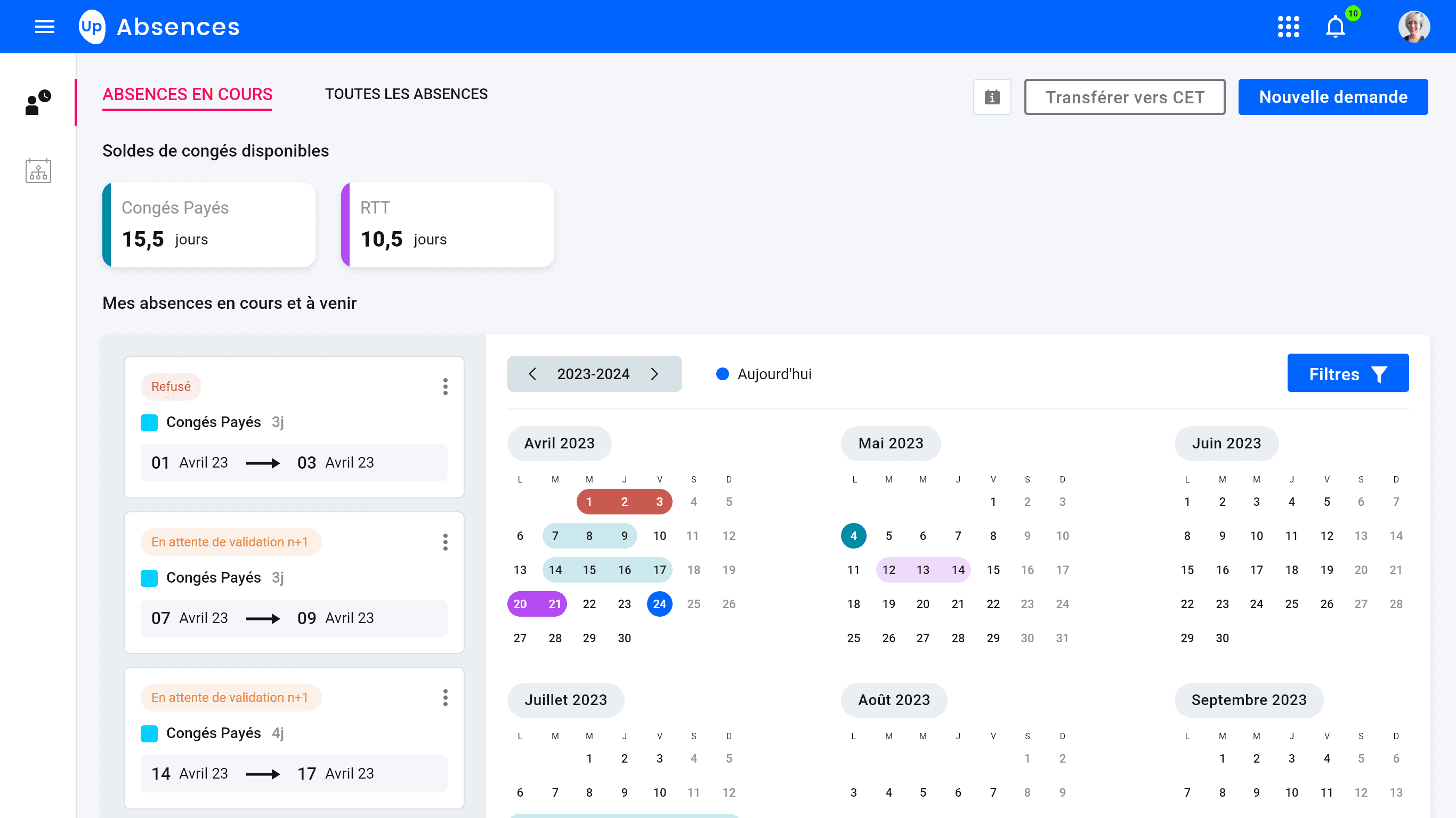
The employee dashboard highlights the essentials: vacation balance and pending requests. Quick access to vacation requests reduces friction.
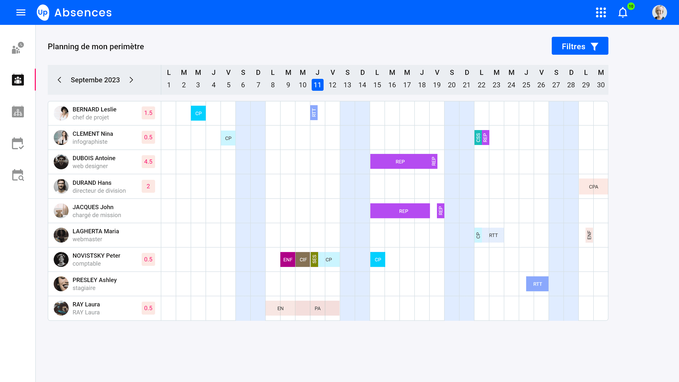
Screen 1: Manager Dashboard
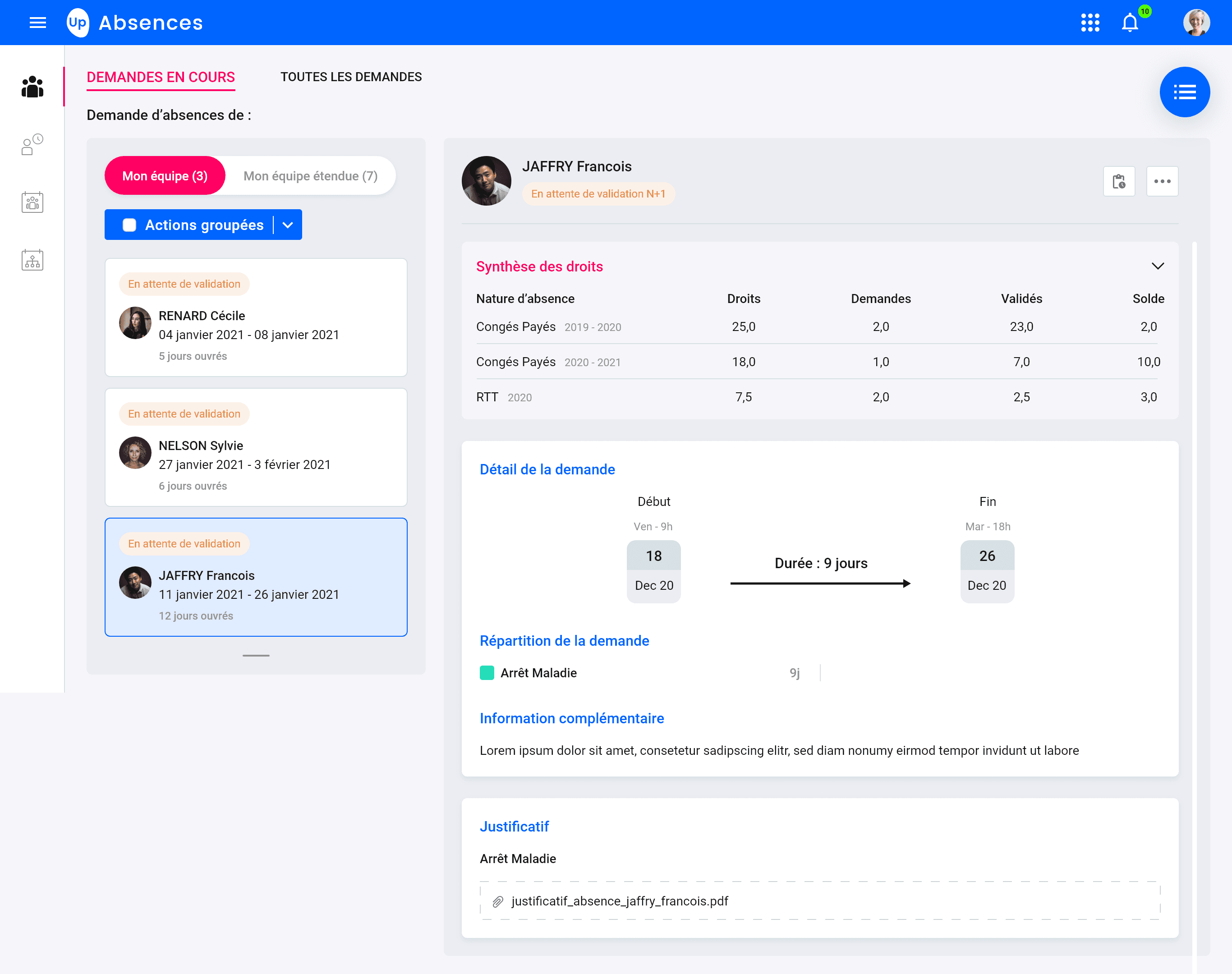
Managers can immediately see what needs their attention. The calendar view helps anticipate the impact of absences on the team.
B - Leave request
The critical moment: the most frequent action, the one that must be the most fluid.
Challenge: Simplify as much as possible without losing essential information (type, dates, comments, balance). Create a guided but quick process. Avoid errors while remaining flexible.
The goal: Move from a complex, multi-step form to a clear and reassuring one-page experience.
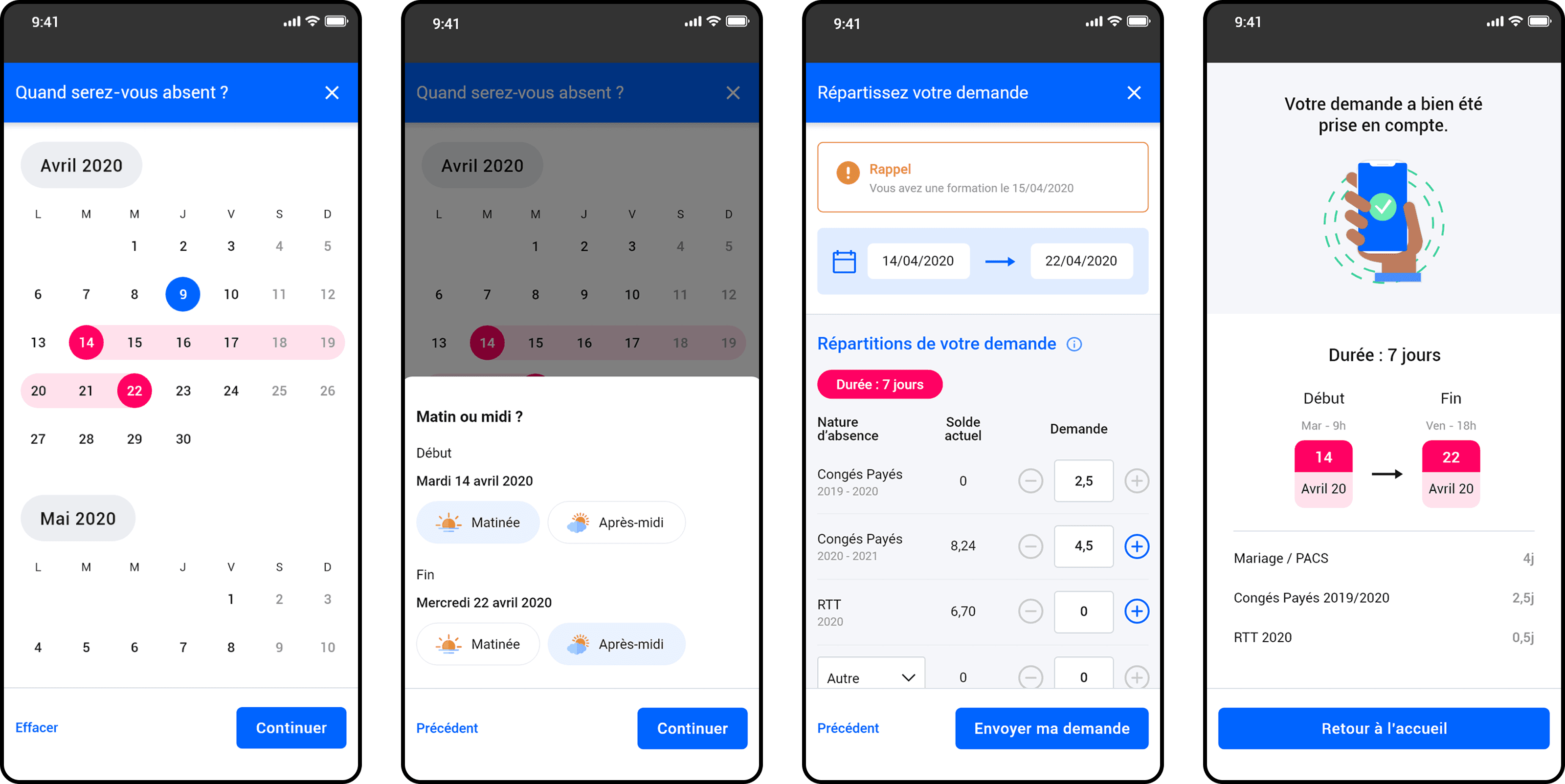
Step 1: When will you be away?
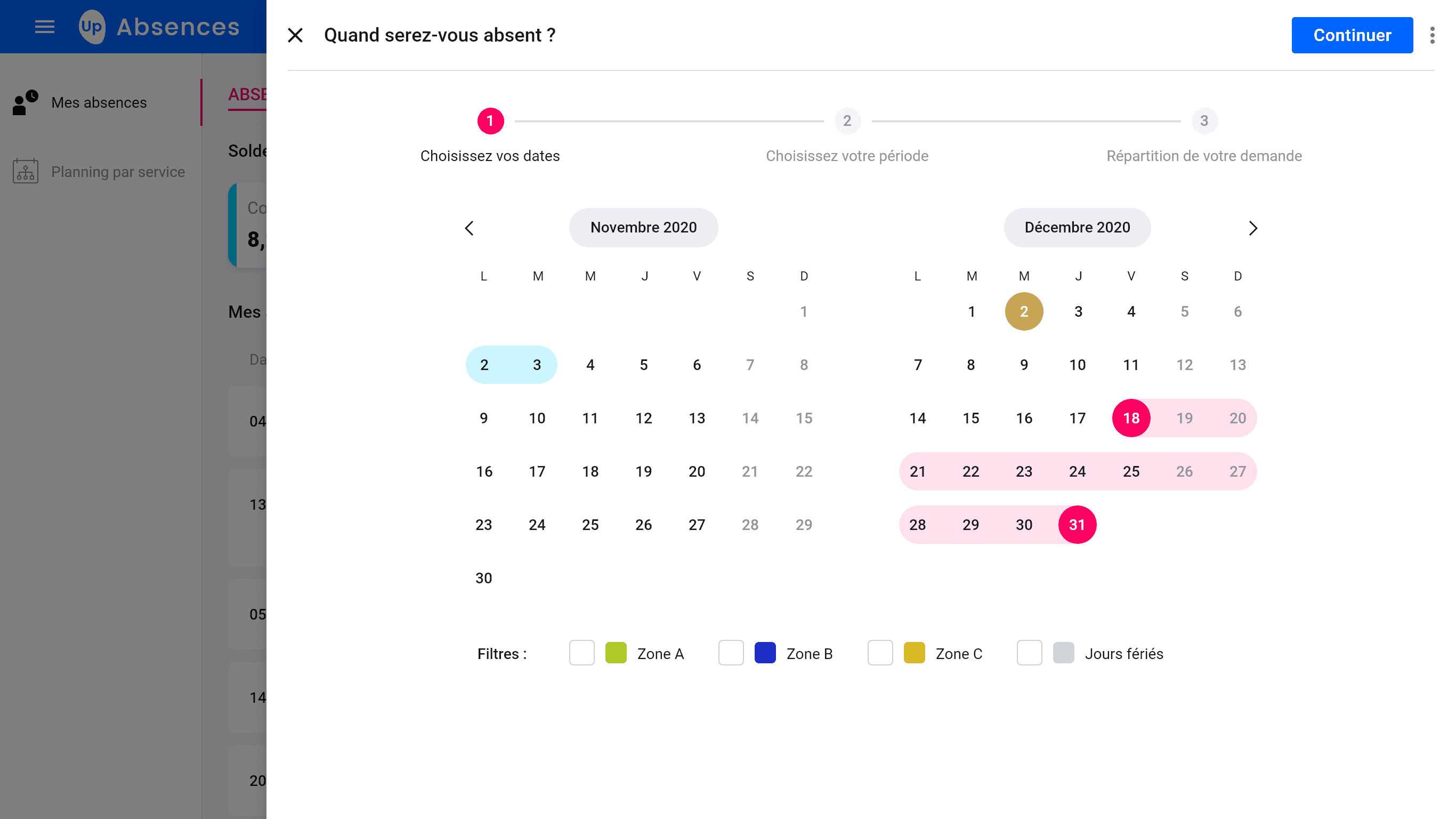
Double month calendar with smart filters (Zones A/B/C + Public holidays).
Date selection highlighted in pink. Automatic calculation of working days.
Step 2: At what time of day?
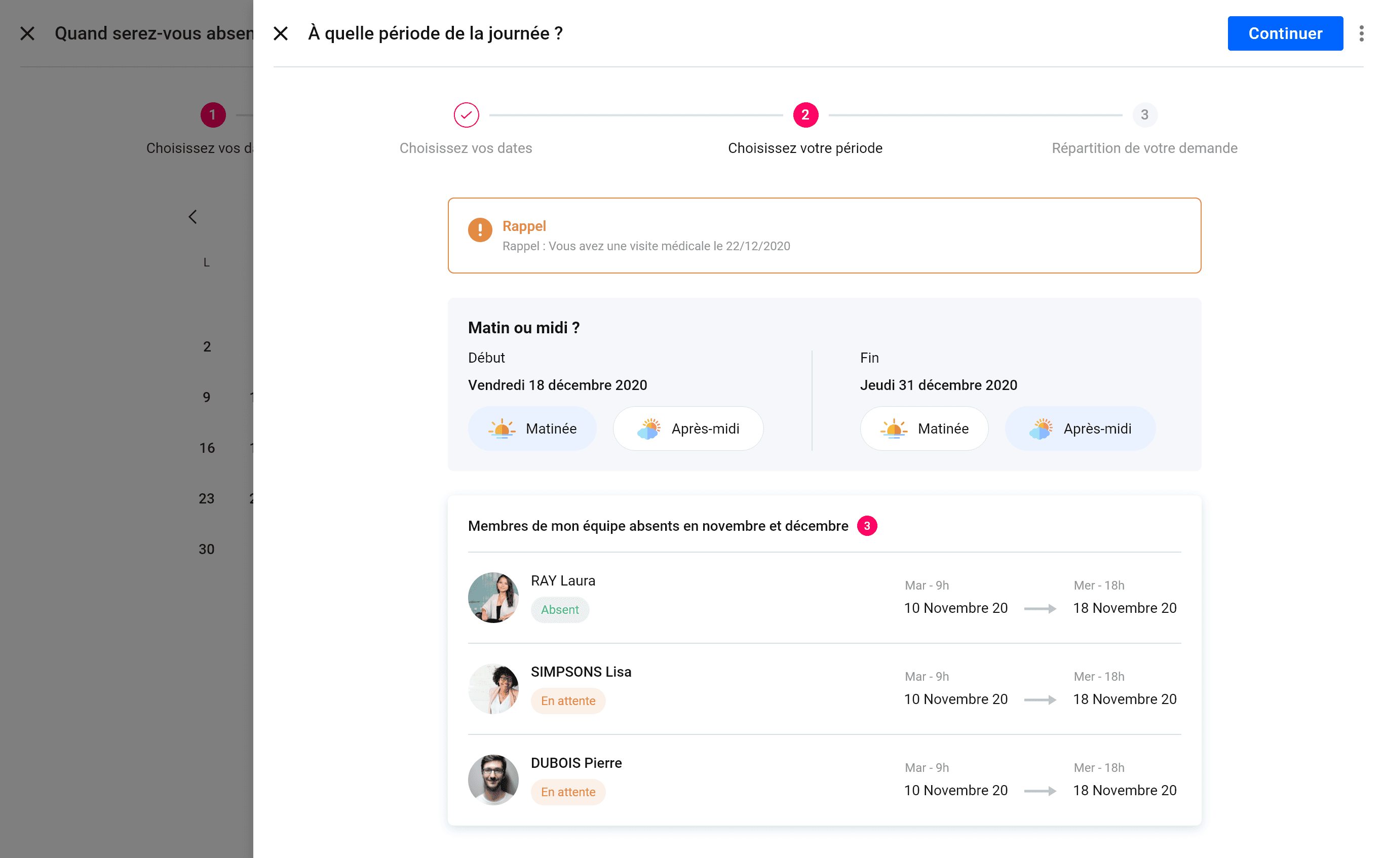
An alert if there is an event during the selected period
Refining the start and end dates of your absence period
Members of your team who are absent during your absence period
Step 3: Distribution of your request
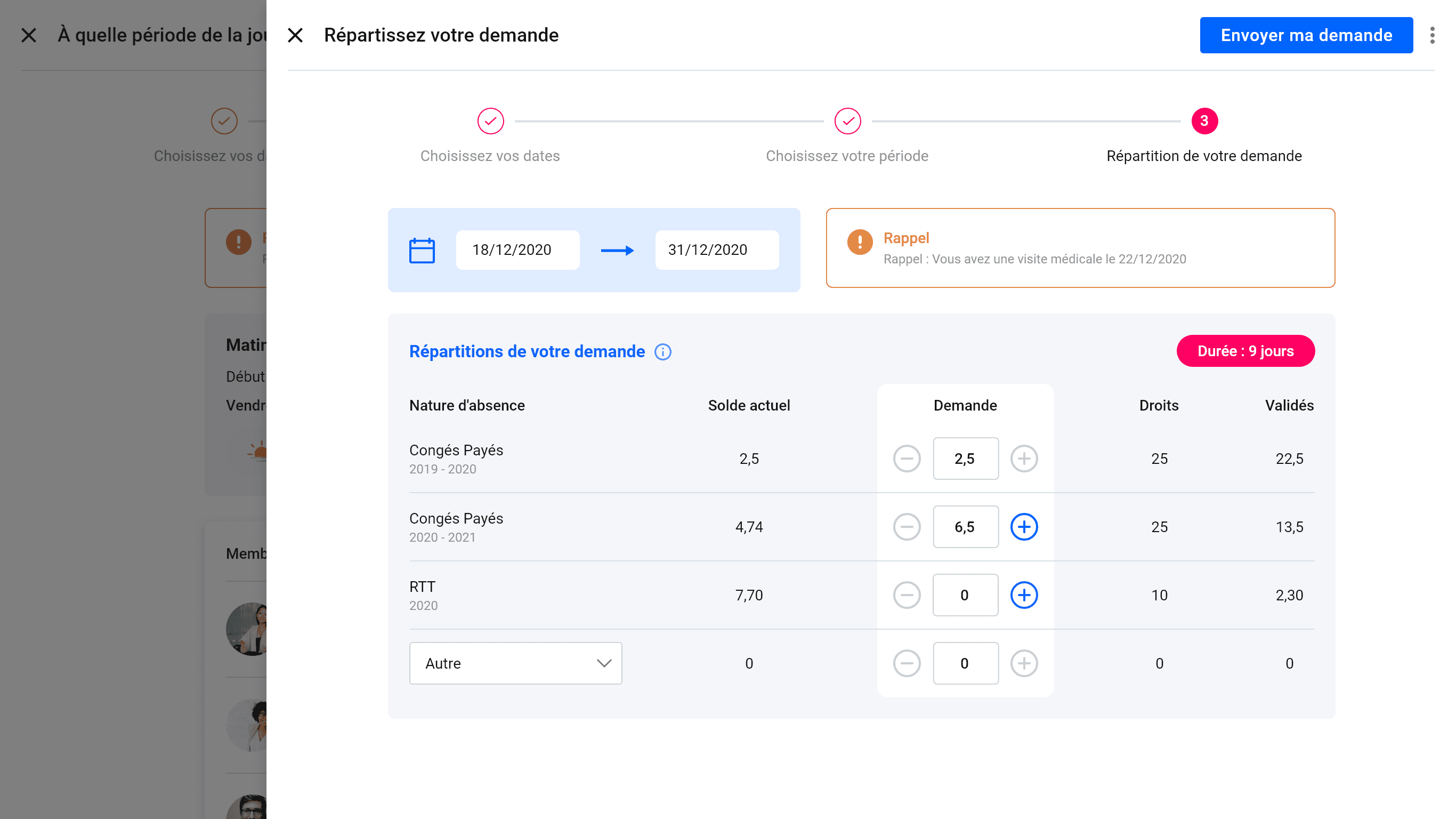
Distribution table with +/− counters. Real-time balance.
Multiple types of leave (vacation, RTT, marriage/civil union, other). Badge “Duration: 9 days.”
Step 4: Validation
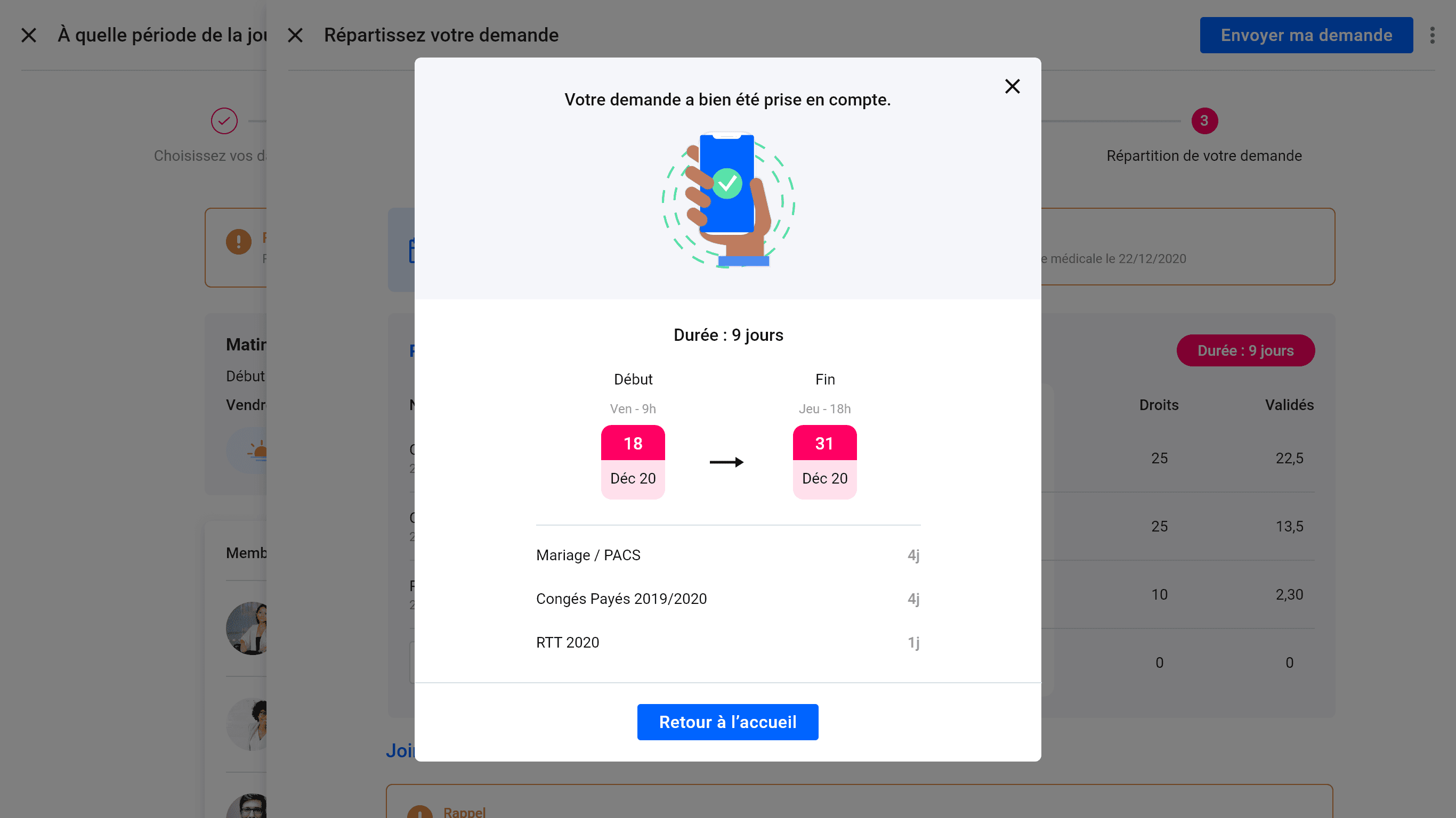
Visual confirmation with a complete summary: dates, periods, detailed breakdown.
Reassuring status, the user knows exactly what has been sent.
Mobile version
C - Validation workflow - Transparency and traceability
Once the request has been sent, the employee can track its status in real time: awaiting manager approval, approved by manager, awaiting HR approval, approved. The manager and HR receive clear notifications and can take action directly from their dashboard. The process is transparent, so everyone knows where the request stands.
D - HR Calendar - Consolidated view of absences
Consolidated view of absences for the team (manager) or company (HR). Automatic update as soon as a request is approved. The information is clear: who is absent, when, and what type of leave.
The calendar consolidates all absences into a clear overview.
Managers anticipate the impact on the team. HR monitors overall trends.
5 - Learnings
Designer without direct access to users
Working without interviews or tests has taught me to maximize other sources: extensive competitive benchmarking, internal business expertise, and rapid iterations with the product team. It's not ideal, but sometimes that's the reality of project constraints.
The value of business expertise
David, our business expert, was instrumental in anchoring the design in the reality of the product and customer expectations. I learned to structure my proposals to facilitate this design/business dialogue, always presenting 2-3 well-argued options rather than a single solution.
Simplify without compromising
The challenge was not to add features, but to make existing ones accessible. I refined my ability to identify what should be immediately visible vs. accessible with one click, to create clean yet comprehensive interfaces.
The importance of user validation
The lack of post-launch feedback still frustrates me. If I had to do it again, I would have insisted on having a few user testing sessions before development. Design without validation remains a hypothesis, not a certainty.